Graphic Design Alumni MFA Thesis Exhibitions
2022
Sadie Sullivan
www.sadiefsullivan.com, Instagram: @sadiefsullivan
Sadie Sullivan’s artwork is a microscope of sorts into the artistically detailed functions that make up our body, whether it is mentally or physically visual. She was born and raised in Seattle, Washington, and was drawn at an early age to the city’s innovative lifestyle and dedication to technology and medicine. She graduated from Western Washington University in 2016 with a Bachelor of Arts, with an emphasis in drawing and illustration and two minors in Art History and English.
While at Ohio University, Sadie worked for the Communications Science and Disorders Department illustrating hundreds of images for a National Institute of Health intervention grant application and pilot studying children with language impairments. She has built and maintained the new Graphic Design website through Drupal and taught numerous graphic design undergraduate classes. Before Covid, you would occasionally find Sadie drawing in the cadaver labs here in the Osteopathic medical building.
Currently, Sadie is working at Arizona State University for the Sandra Day O’Connor College of Law as a Web Content Editor.
With Due Respect
Abstracted from Sadie's Thesis Document:
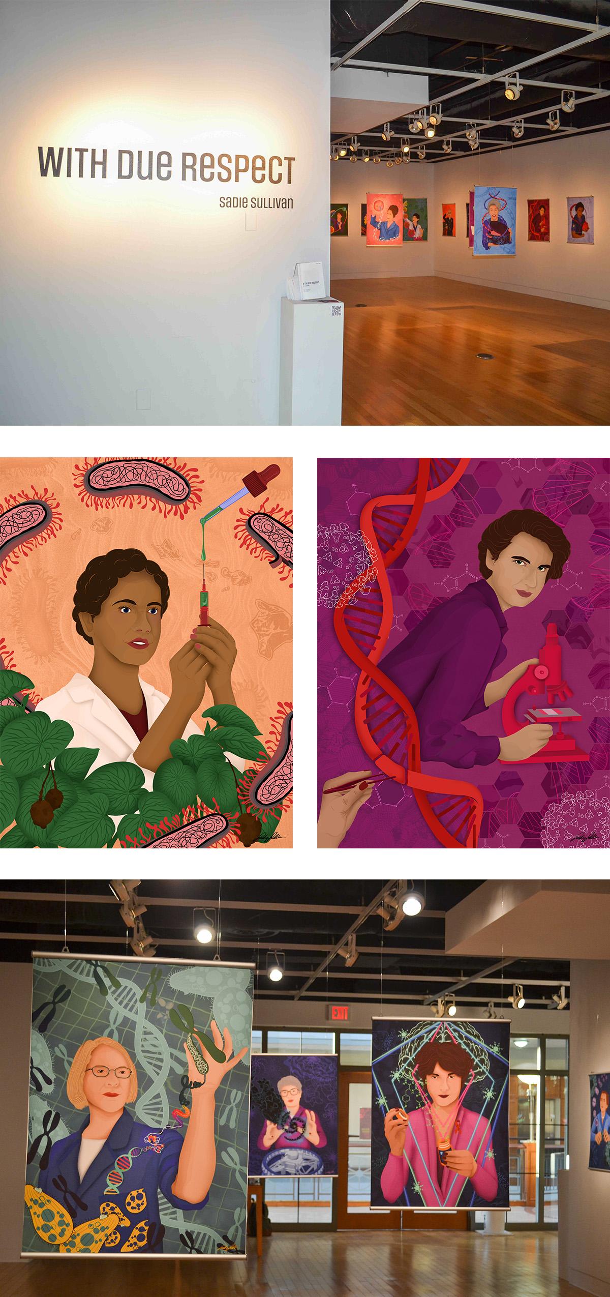
The Matilda effect is a phenomenon in which women’s achievements are credited to their male colleagues. This is a pattern of overlooking women who have made significant contributions to society. With Due Respect celebrates the achievements of women who have been subjected to the Matilda effect. My intention is to inspire the next generation of women in Science, Technology, Engineering, and Mathematics (STEM).
Despite each of their discoveries, these women faced years of gender discrimination in their scientific fields. The exhibition opens a conversation about women who often were fearful of speaking up and thus isolated themselves and deprived society of their further contributions. With Due Respect asks: Why have women, specifically working in STEM fields, been written out of history, and how does that impact our current perception of the world?
Digitally illustrated portraits are complemented by narratives of women and their achievements. The portraits were designed on an iPad tablet using Adobe Fresco digital drawing software. Blending colors and photographs using a variety of Adobe brushes, sketches became digital painted canvases of colors and textures overlapping one another. Each subject is posed and sketched in an action position reflecting her ownership of her hard work and achievements. The portraits are my conceptualization of their accomplishments.
The women are organized chronologically by birth from the years 1900-2000. Their research, discoveries, and awards overlap one another in fields ranging from physics and astronomy to biology and chemistry. My goal is for my audience to learn from and share these women’s stories.
Daniel Opoku
https://www.danielopoku.com, Instagram: @dani-opoku
Daniel Opoku grew up in a post-colonial Akan state, Kumasi, Ghana. The ancient city mark as a historical state that first rose against colonialism in West Africa in the early 1900s, and yet could not subdue colonial militancy. The aftermath of colonialism has become a formative influence on how Opoku understands and relates to his environment.
Inspired by the broad conversation around cultural hybridity, Opoku seeks to understand the various facets that form contemporary knowledge of social evolution in the Ghanaian post-colonial cultural space. He investigates the influence of Western Cultures and its impact on himself first, and other Ghanaians who live in such spaces. This results in a unique third personality. A personality evolved from immediate experiences and the interwoven history of the pre-colonial and colonial ordeal in the Ghanaian cultural and socio-political space.
Opoku excavate the layers of history deposited over time as a result of colonization. This is evident in the process of snipping and layering through digital manipulation as a metaphor to exchange a dialogue of Cultural hybridity, and further negotiate a space for a true Ghanaian Identity.
IDENTIMATICS
Abstracted from Daniel’s Thesis Document:
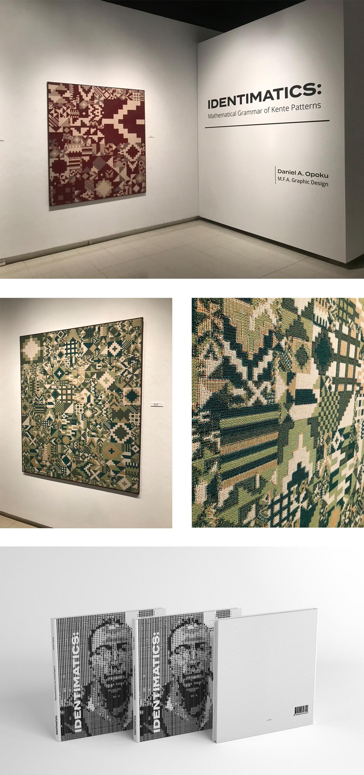
The patterns I project in this exhibition are visual essays of historical narratives and wise sayings woven with mathematical calculations. As a result of my calculations, I interpret the geometric shapes that form the Ghanaian Kente patterns using mathematical formulas parallel to the Pythagorean theorem as an attempt to blur the boundaries between “mathematics” and culture.
As a survivor of pedagogic violence, the state-driven mathematics I learned was based on foreign concepts, where mathematical ideologies from alien cultures were superimposed on my local mathematical essays; concepts that presented abstract theorems and projections, instead of my everyday experiential examples. By cross-examining the “TICS” of the “MATHEMA” in the Ghanaian Kente pattern, I affirm mathematics as a global language except for different ways of visualizing meaning.
I build upon D’Ambrosio’s concept of ethnomathematics by introducing Identimatics; a term I formulate from Identity plus Mathematics. The latter addresses the limitations of the other by including the numerous ways to sample relationships within and outside one’s culture into another. The exhibition concludes that for the greater understanding and advancement of mathematical knowledge, all cultural mathematical projections should contribute equitably.
2021
Megan McCormick
https://mmc-design.com, Instagram: @hvanitas
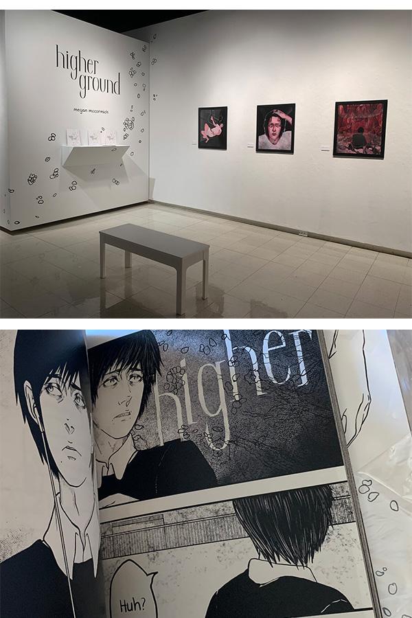
Megan McCormick is a graphic designer, commercial illustrator, and fine artist. Though they have been in the industry for many years creating print and digital designs and commercial illustrations, their current work and research is grounded within the realm of speculative fiction. Their work deals with themes of tension and suspense between both narrative and visual storytelling, what lies just beyond our perception of the world and the scale of the human and unhuman, gender identity, and their experience as a victim of Hurricane Katrina and the cultural trauma resulting from the storm.
Their thesis exhibition Higher Ground: From Graphic Novel Panel to Animation Frame was held at Ohio University’s Art Gallery in Spring 2021. This has extended into identifying specific tactics used within graphic novels, animations and film to increase suspense and tension within a scene (such as how Junji Ito develops suspense and tension through the act of the page flip or Stanley Kubrick who uses perspective to build his scenes within cinema).
2020
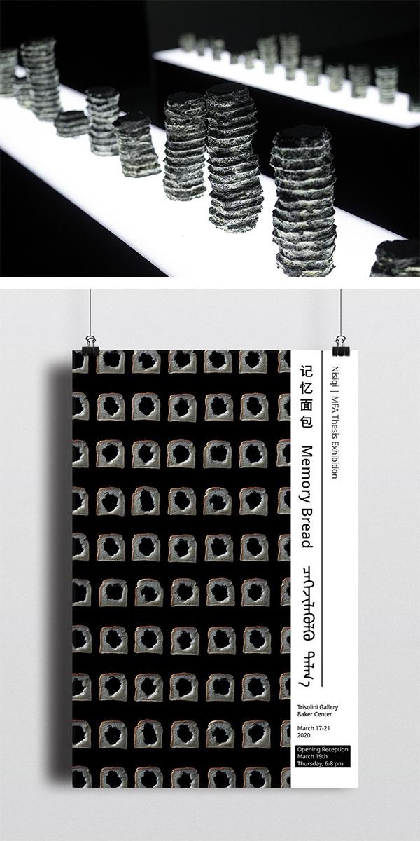
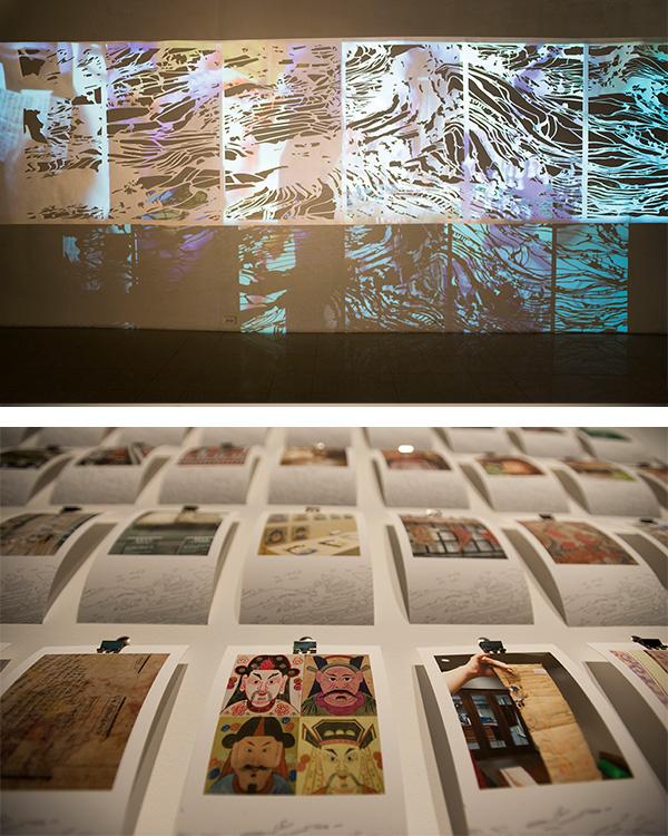
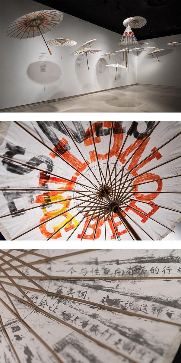
Nisiqi
https://www.nisiqiart.com, Instagram: @nisiqi_art.pdf
Nisiqi’s ongoing research is regarding visual communication design of Chinese-Mongolian’s identity dilemma. It centers around post-colonialism and tribalism and its intersection with global design praxis. She has incorporated her own voice into her works as a multi-lingual artist emerging from a hybrid cultural context. The investigation in visual communication and social semiotics helps her to reveal the complexity of cultural identity as well as to find the contemporary art’s role in cross-cultural understanding.
Nisiqi currently works for the Wexner Center for the Arts at Ohio State University.
Memory Bread, MFA Thesis Exhibition - watch the performance
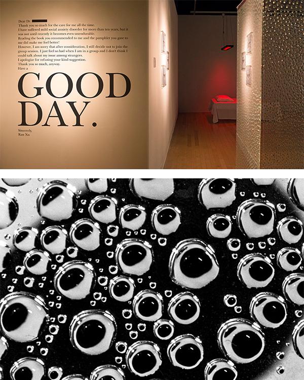
Ran Xu
https://bcy.net/u/302714/post/note, Instagram: @ran.xxvi
Ran Xu’s ongoing research is based on the social-phobia and social anxiety disorder, surrounded by her personal experience and emotional experiences, trying to visualize negative thought processes and the potential solutions among different patients who have similar issues.
Her interests in design are pretty broad, especially in terms of digital art. Besides her academic, she also works as a commercial illustrator in China, and provides her illustrations to various types of companies including magazine press and online novel websites.
2019
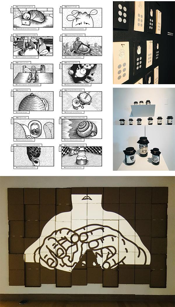
Maryam Khaleghi Yazdi
maryamkhaleghiyazdi.com, Instagram: @maryamkhaleghiyazdi
Maryam is an Iranian multimedia artist and design professor based in Minnesota. The area of her work and teaching covers different realms like digital art, illustration, augmented reality, animation, and graphic design. Currently, Maryam is exploring her identity as a person who has migrated from Iran to the United States. She is applying illustration as a vehicle to expose her state as a person who lives between two different countries.
Living in Between
Abstracted from Maryam's Thesis Document:
“Living in Between” is an interactive, multimedia piece that contains four individual pieces. These pieces narrate my life between two countries, Iran and the United States. The first three pieces are about changing the appearance of American objects: pickle jars, pizza boxes, and lottery tickets. I have picked these objects from my daily life to show how I see them as an immigrant in the past, present, and future and convey the concepts of development, loneliness, and vulnerability. The fourth piece consists of six augmented reality illustrations that narrate how I interact with my shadow that symbolize my thoughts about living in two different cultures.
The United States is a diverse community, willing to accept people from different cultures, but since the 2017 immigration executive order, our lives as immigrants have changed a lot. This phenomenon made me reconsider the concept of home and identity. People need to live in harmony with immigrants, so they should know about their lives. With my art, I want to encourage American audiences to better understand us.
MIA is a great venue for me to show “Living in Between” because it provides a professional space as well as proper funding. I consider Minneapolis my second home and showing my art in this great institute will make a connection with the art community and me. Moreover, it allows me to contribute to the diverse community of Minnesota by speaking about my life and experiences through the language of art.
The Living in Between animation project can be found on Maryam's website.
Currently, she is the assistant professor of Graphic design in the Art and Design department at the University of Minnesota, Duluth. She received her B.A. and M.F.A. in Visual Communication from the University of Tehran, Iran, and her second M.F.A. in Graphic Design from Ohio University, U.S.A.
2018
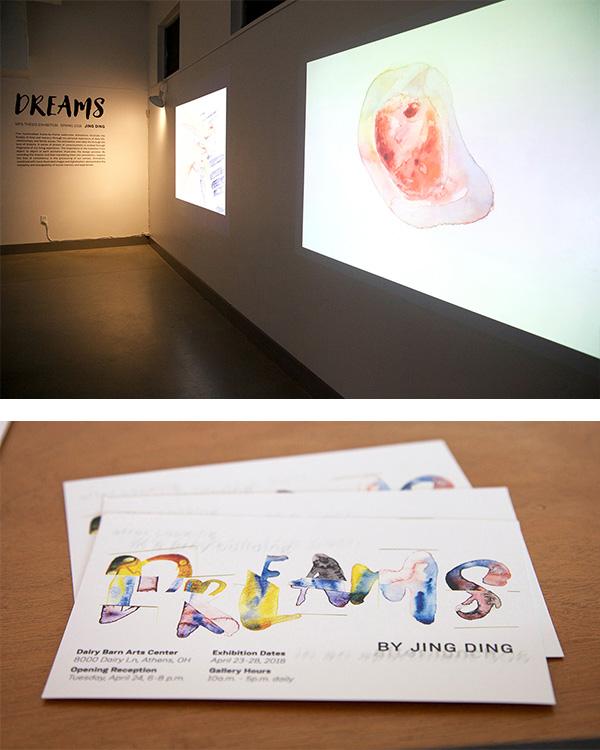
Jing Ding
Linkedin - https://www.linkedin.com/in/jing-ding-30385bb7
Dreams
Abstracted from Jing’s Thesis Document:
Five handcrafted frame-by-frame watercolor animations illustrate the fluidity of time and memory through my personal experience of daily life, relationships, and family issues. The animations view daily life through the lens of dreams. A sense of stream of consciousness is evoked through fragments of my living experience. The importance of the transition from object to object in each animation illustrates the design process. By recording the dreams and then translating them into animations, I explore the loss of consistency in the processing of our senses. Animation, combined with hand-illustrated images and digitalization, demonstrates the instability and changeability of human memory and experiences.
Jing currently works as a visual designer for China Entertainment.
Shiva Ghasem
DUALITY
Abstracted from Shiva’s Thesis Document:
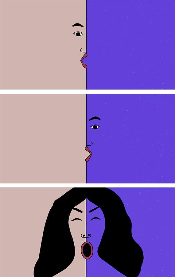
These six, short, handcrafted, frame by frame animations represent the concept of dualism in gender, culture, and identity. The symbolism in these works depicts an identity as having a cyclical nature. Dualism in these animations is represented by the interplay of conflicting or complementary opposites. Two forces continually battle symbolically in each world. They go by many names: consciousness and unconsciousness; day and night; masculine and feminine; personal and mass culture. Three of the animations are based on the idea of unity, while the other three explore the idea of conflict ion. In this way, identity is depicted as existing in the space between unity and conflict. These animations are inspired by my first experience navigating between two cultures, departing from Tehran (East) and arriving in New York (West). Since then, I've been contemplating the duality of life, and how two sides of a coin constitute the same force – in particular, how my identity fluctuates in each culture. The animations depict the struggles I’ve experienced between two realms as duality between the left and right halves of the brain.
Tiansen Wu
Linkedin - https://www.linkedin.com/in/tiansen-wu-814851b7/
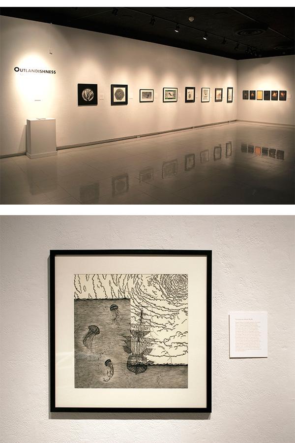
Outlanddishness
Abstracted from Tiansen’s Thesis Document:
This set of works is based on a book called “of Cabbages and Kings: Analean”, written by Felix Xillow-Wusha. The book is an unpublished speculative fiction story of a girl named Analean, who wakes up in a world thousands of years in the future. Then, in her following adventures throughout time and space she encounters gynoids, hagravens, vampires, cardinals and cultivators. The formatting of the book is based on ergodic and Novae Roman literature, which requires the readers to actively participate within the text, thereby creating their own experience. Instead of visualizing the text literally, I attempt to construct a coded interpretation of the material that I connected within my own personal interaction with the book. Rather than being literal representations of what is in the text, merely, they are possible visual perceptions that one could have. In short, this thesis is an examination of the production of meaning through an audience’s interaction with art. Thusly, rather than the audience attempting to discern what the artist actually meant, it is left to the perceiver to discover or manufacture their own connections.
Tiansen Wu currently is a Designer for Bonfire Red, Columbus, OH. He is also a Graphic Designer in Tessellate Studio, NewYork, NY (Contractor).
Mohammad Farhang
Neither From Nor Towards
Abstracted from Mohammad’s Thesis Document:
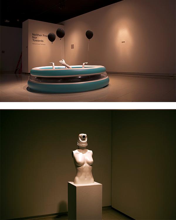
Design has been and continues to be a major influence on the effect of commercialism in modern societies. During a period of expanding consumer markets, graphic design emerges as a distinct creative practice. It affects processes of a mass production, known to brashly yet ingeniously promote various goods that have come to fill our everyday lives. Thanks to capitalist trends stemming from wealthy western countries, design has become a force driven by both art and economics. In today’s age of industrialization, people find themselves reliant on technology and name brands, (i.e., Apple, Microsoft, Coca-a-Cola, and McDonalds).This phenomenon has created a strong sense of familiarity that has seeped into societies across the world regardless of borders and other prominent factors of the human condition such as religion or racial identity. Never before has a time existed inhuman history in which people, separated by vast expanses of geography and cultural dissimilarities, share a common intimacy with widely known commercial goods. All of a sudden, children in sub-Saharan Africa can draw memories and experiences from looking at a Pepsi logo much the same way American children can. This great exportation and expansion of commercial design has created a globalized sensation, in which the most popular goods become intertwined with what it means to be a citizen of the 21 st century and a modern human. In this show I want to showcase this perspective on commercial design and it sever-growing, intimate relationship with the modern human experience by using aspects of pop art. Pop art is an artistic movement that has grown side-by-side with consumerism. As consumerism has expanded so has pop art and its purpose of reflecting on popular culture; it is a vivid critique of the world presently known to man. The relationship that exists here is mutually beneficial to both parties because pop art serves to validate the presence and power of commercial consumerism while pop art is directly inspired by commercialism. I have wondered if the relationship between consumerism and pop art carries a similar intimacy to that carried between consumerism and the consumer, and so I chose pop art as the medium to convey my ideas. The physical body of the show has been designed based on the 1+1=3 rule. In order to communicate with the viewer’s unconscious, for instance, two different elements, objects, images etc. will be mixed and juxtaposed together to examine anew meaning. This juxtaposition will be fit and take place within Pop art style.
After receiving his MFA in Graphic Design from Ohio University in 2017, Mohammad moved to New York to work with 2x4 Studios. At 2x4 Studios, Mohammad learned to apply animation to a branding system. Mohammad’s knowledge of fine art allowed him to team up with the Jewish Museum NYC as Junior Designer in fall of 2017. His time spent at the Jewish Museum made him able to serve as a liaison between graphic design and fine art. In addition to his work with graphic design at the Jewish Museum, Mohammad found himself immersed in his work and taking on new roles like exhibition design. At Sullivan NYC, Mohammad utilized all of his design knowledge to develop cohesive branding for large corporate brands like Merrill Lynch and JP Morgan Chase. Working with these design firms allowed Mohammad to refine his graphic design skills and become a mature multidisciplinary designer with a fine art background. He is currently working towards completing his Ph.D. at Ohio University.
2016
Misty Thomas-Trout
http://www.mistythomastrout.com/
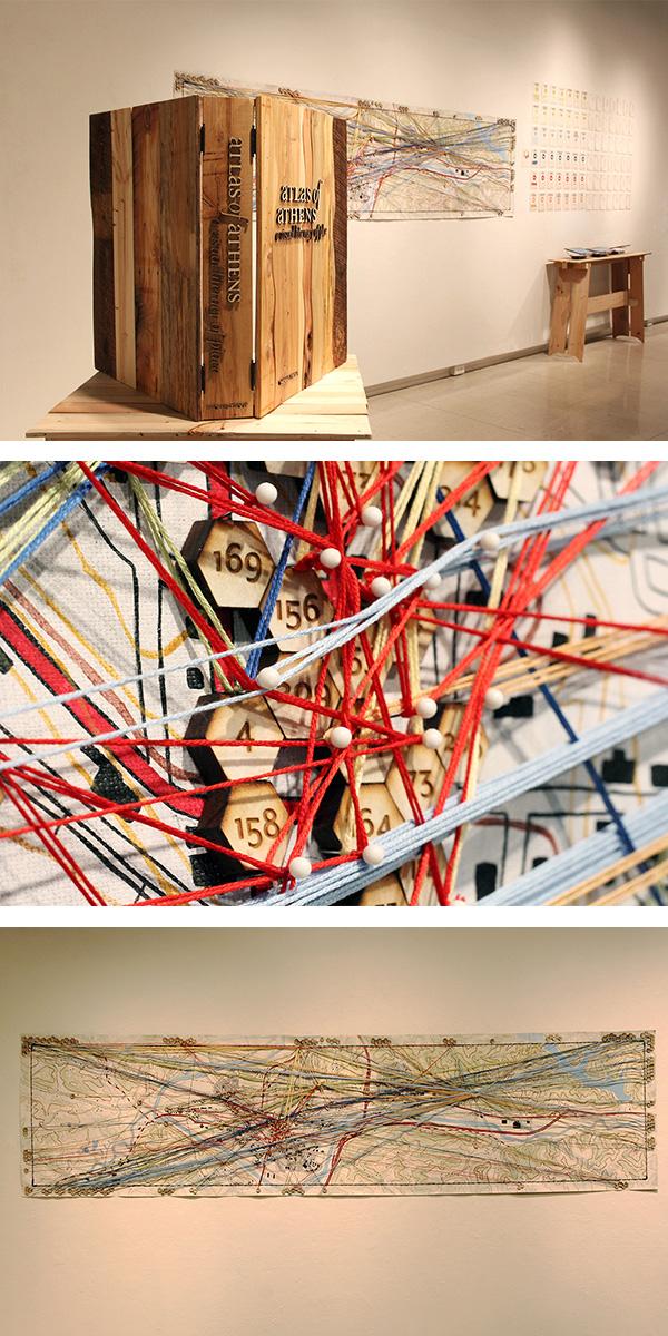
Atlas of Athens - A Visual Literacy of Place
Abstracted from Thomas’s Thesis Document:
Atlas of Athens: A Visual Literacy of Place is a case-study that visualizes the network of people working together in Athens. Atlas of Athens came about through the recognition of how I changed my own behaviors due to the interaction with the people and the culture of this place. This research project is an effort to convey the connections that strengthen the economic health of this community and how place affects the individual. It suggests the value of strengthening the relationship between design, humanity, people and the environment. The results of this research demonstrate that support for direct, first-hand relationships and local economic networks and how they affect human patterns of behavior and foster positive change in small communities such as Athens. More importantly, this research is showing how people connect with one another and how they connect resources to the people. This allows for a larger audience to learn ways in which they can insert themselves into their community in an effort to benefit their individual life as well as the community at large. Mapping out economic networks in an effort to re-veal the interconnected nature within systems is a driving force behind this project. Making these relationships visible through art and design is one way of communicating these complex connections. I can expose visually what is working and what is not. Experience has taught me that through direct relationships and interactions of support, people tend to care more about their part in the whole. It has shown me that we are interdependent. We do make individual choices, but they are not made in isolation. Our everyday decisions affect those around us as they also create patterned ways of living — patterns that build the social and cultural environment that surrounds us. How are you connected to this place?
Currently, Misty is working as an Assistant Professor and graphic designer for the in University of Dayton.
University of Dayton - https://udayton.edu/directory/artssciences/artanddesign/thomas-trout-misty.php
Qing Wang
https://qingwang.work
Linkedin: https://www.linkedin.com/in/qing-wang-0a668b63
diasp o r a : A visualized project inspired by the Yao Ceremonial Artifacts Collection
Abstracted from Qing’s Thesis Document:
This thesis explores concepts of fragmentation, hybridization and fluidity through integrating study, research, and experiment with the Yao culture. With multi-disciplinary approaches, this project attempts to encapsulate cultural experience through a novel visualized project which is detached from the original source to create new connections with personal experience in a contemporary context. The examination in the Yao Collection in the Alden Library, the international interviews, and field research in China inspired the realization, I too have transitioned in a similar pattern.
Qing Wang currently works as a multimedia producer at Ohio University. In previous years, she worked as RA and GA for the Kennedy Museum of Art, College of Fine Arts at Ohio University, and obtained her MFA in graphic design from OU.
Yi Zhang
https://www.yizhangdesign.com/
Linkedin: https://www.linkedin.com/in/yizhangdesign/
Hidden Identity
Abstracted from Yi’s Thesis Document:
Identity is the fact of being who or what a person is. It can be formed from the roles we undertake, the activities we complete, and our physical presentation. I might see myself as a Chinese woman, a student, a neighbor, a daughter — but my identity is much more complex than that, and is shaped by complex forces. Sometimes I keep parts of my identity hidden. Awareness of this helps me be true to myself, even as I try to connect with others, feel belonging, show my affiliations, and express who I am.
I have studied how people express their identities, and how they hide or add expressions of identity to try to get a sense of belonging. I have noticed how I too have done this. The evolution of anyone’s identity can be a long process, but identity can also change suddenly, following key life events. This exhibit presents work that communicates important parts of my life story and identity. It extends a personal realization based on my observations, research and reflection.
Wall 2: Introduction
For most of my life, I have lived in China. My identity is Chinese. I know that red is an auspicious color; six and eight are the lucky numbers. I drank green tea, read Chinese characters, bought clothes labeled "American style," and tried Indian curry made by Chinese cooks. All of these things are natural for me. The summer of 2013, I came to the United States. One day, I held an umbrella blocking the sun while I walked on the street. This is a very normal thing for girls to do in China. However, it is rare to see anyone doing it in America. I felt insecure to act differently and stand out in a new culture. So I began to close my umbrella and begin a process of reflection about how I have done this in my own life, not only with the umbrella.
Wall-3: Story 1 I hold umbrella in summer
In China, I always held an umbrella during summer, because Chinese people believe that white is the most beautiful skin color for a woman to have. Yesterday, my Chinese friend pointed at a girl and said, “Look at that tanned girl, her skin is so pretty.” I notice that, in the United States, the tanning bed is like my umbrella.
Wall-4: Story 2 I love McDonald’s
In China, McDonald's is not the place to buy cheap food. In my childhood, my desire was to go to McDonald's to celebrate my birthday. Right now, if you ask me where to go to eat, I would say, “Anywhere but McDonald’s,” because Americans say it is junk food. The taste of the hamburger didn’t change, my identity did.
Wall-5: Story 3 I am Chinese
People ask where I come from. I say, “China.” They say “Wow!” I have to wonder how many people see me as just Asian.
Wall-6: Story 4 I am the woman like holding hands
In China, I like to hold my best friend’s hands walking in public. Chinese people do not believe that hand holding is a sign of sexual orientation. In the United States, I heard that this behavior might make others assume we are lesbians. I wonder how many people choose to hide their affection because they do not want others to judge them.
Wall-7: Story 5 I am Zhang Yi
My name is Zhang Yi. I use it to sign, and to introduce myself in China. My first year in the United States, I asked people to call me Jenny, because I thought it would be easier. After one year, people showed me they could pronounce my Chinese name. So my name went back to Yi. Later, I found that there is another name linked to my identity — my student ID number. It is important for many reasons, but it means much less to me.
Wall-8: Conclusion
This body of work conveys stories about my identity and how it has evolved over time and place. Maybe it resonates with some of your own stories. Perhaps, it is the story of our next generation. No matter where we are, as long as we recognize how our identities have been formed, and appreciate even the parts we sometimes hide, we will not get lost.
Yi Zhang is currently an exhibit graphic designer at Hilferty & Associates (Athens, Ohio). Before that, she worked at IKEA (Columbus, Ohio) as an interior designer.
Her main design projects include: American Museum of Science and Energy (Oak Ridge, Tennessee), Berea College, Yahng Family Discovery Center (Berea, Kentucky), Homeless Family Foundation (Columbus, Ohio), Buck-i-Frenzy (Columbus, Ohio)
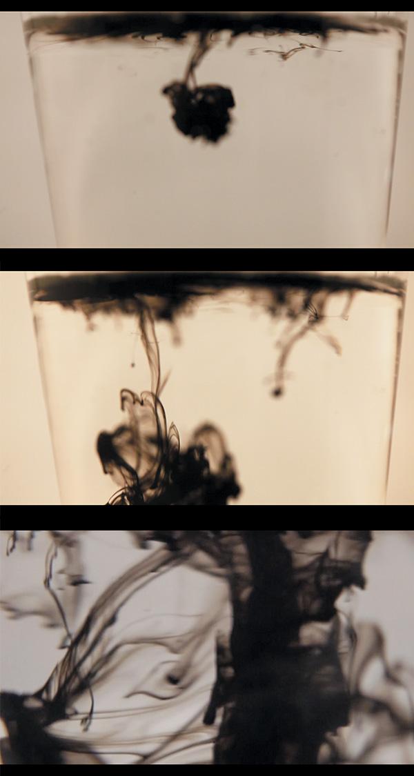
Zoey (Yuanqing) Zhao
Translation
Abstracted from Yuanqing’s Thesis Document:
Translation is an attempt to reconstruct and re-imagine, from a contemporary perspective, a tradition. This thesis research is important in analyzing Eastern rituals and perspectives in a Western academic environment. A ritual is an experience that is highly structured and follows a very specific set of rules. The rules vary to each ritual but the purpose of the rules is to create a sense of tradition and divine experience. In short, rituals are experiences that are created through an intricate and strict structure, in a sense, chaos from order. Translation focuses on the interactions in/with water of tea leaves, ink, paper, poetry. Taking Wallace Steven’s Tea at the Palaz Hoon (1921) and cutting out all the words, I have mixed those individual words with paper, analogous to the interaction between tea and water. Consciousness vanishes and notion being in the world is achieved for myself and observers. Tranquility and serenity are brought upon the observers in their ergodic interpretations of my work (Espen J.Aarseth 1956 – ). When I am making tea in a cup, tea leaves float on the top in the beginning but slowly and very gradually, individual tea leaves sink to the bottom of the cup. The concept of movement, in general along with relevant experiences are behind Translation.
2014
Hind Arajehi
Linkedin - https://www.linkedin.com/in/hind-arrajehi-3ba2b495
Can spontaneity be part of a plan?
Abstracted from ArRajehi’s Thesis Document:
In creative processes, it could be one of the most valuable strategies we have. This research explores the value of letting go of control in the process of making; it embraces the intelligence of randomness, chance, and apparent nonsense.
Human invention is often the result of noticing the outcomes when something goes wrong. Unplanned events can, at times, lead to more desirable results than planned events. This is the essence of creativity. To explore these concepts, I conducted inquiry through both generative and documentary processes. First, I created random visual experiments using simple tools and repurposed materials. Natural elements such as light and gravity affected both process and results more than I had predicted. These observations led me to pay attention to seemingly insignificant details in my everyday life. I began to document mundane occurrences in the places I inhabit in my day to day life: shadows moving on surfaces, reflections of light on metal and glass, liquid solutions interacting in a clear drinking glass. I organize still and moving images in an attempt to share the details of my process. Publication of this research speaks to the importance of cultivating creativity through observation and experimentation. This is valuable to consider in this time where rigid planning is considered essential for achievement.
Hind currently has her own design studio and is enjoying her time to paint and purse printmaking.
Michelle Ensch
Linkedin: https://www.linkedin.com/in/michelle-ensch-3ba62852/
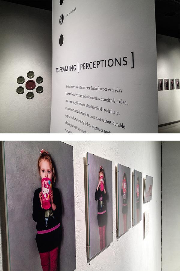
re: FRAMING
Abstracted from Michelle’s Thesis Document:
The word frame often brings to mind a wooden device around a picture, or a process of creating structural support in engineering. In fact, framing has a lot more to do with daily life than most people can imagine. In social science, this concept is known as the social frame. Social frames include external cues that influence everyday human behavior. They take various forms, which involve customs, standards, rules, and even tangible objects. When it comes to making choices, most individuals are more susceptible to these cues than they would like to believe. This thesis addresses social framing as it pertains to overconsumption. In particular, it argues that seemingly benign food containers, such as paper cups and dinner plates, can have a considerable impact on human eating behaviors. Scholarship within the fields of nutrition, psychology, social science, and cultural history informs the investigation, along with comparative analyses of social norms over time. Presentation of the research unfolds through writing, photography, and multimedia installation. Social framing lays the foundation for serious health consequences across the United States. The framing that pervades convenience-food establishments is contributing to an obesity crisis of epidemic proportions. Since obesity is the cause for irreversible, systemic health problems, the growing portioning of food is an acute threat to individual health and well-being. Understanding this complex mechanism is a key step toward studying social frames and mindsets that influence behaviors and seriously impact our human community.
Michelle Ensch currently is a Senior. Graphic Designer at UC's Marketing + Communications department. Before that, she was a seasonal graphic designer for the Cincinnati Reds, and Adjunct Professor at DAAP.
Stacey Stewart/Riley
http://www.staceyrileystewart.com
Linkedin: https://www.linkedin.com/in/staceyrileystewart/
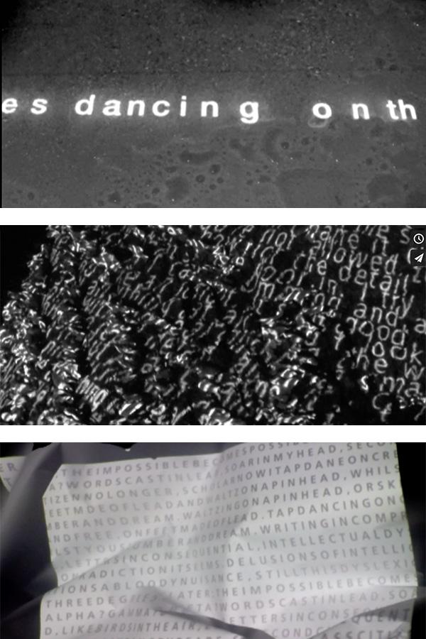
Letters Inconsequential
Statement from Stacey’s Thesis Document:
What meaning does a letter form hold? Some letters convey meaning on their own, while others must to be combined to form words and sentences. What if letter forms combine yet still seem to have no meaning? What if they combine and you are the only one who cannot understand them? Letters and words, devoid of meaning, are a familiar sight for many of us.In the United States alone, one in five people are affected by Dyslexia. While dyslexia is a familiar term, most people have misconceptions about it. Dyslexia involves cognitive processes — including the interpretation of graphic symbols, such as letter forms. According to the American Psychiatric Association, an individual diagnosed with dyslexia is considered learning disabled. There has been productive activity in the research of dyslexia by both medicine and the social sciences, with a focus on answering the question, “What is wrong with the dyslexic learner?” While this type of work is important, dyslexia must be appreciated as a learning difference rather than a learning disability. It is this line of questioning that informs my research.Through manipulation of dynamic typography, I have created environments that offer artistic interpretations of the dyslexic experience. Immersed in distorted moving text, viewers must grapple with the frustration of trying to decode meaning.By offering people opportunities to experience forms of otherness, we can begin to shift the conversation about dyslexia. The notion of dyslexia as difference has value in a culture that tends to emphasize dyslexia as a disability or disorder. Viewing dyslexia as a difference can provide a critical foundation for understanding, inclusion and support for individual thinking styles—in the classroom, workplace and other institutions of our culture.
Current & Recent positions
1. Visiting Assistant Professor, Graphic Design & Photography. Sept 2018–present, Art Department, Marietta College, Marietta, Ohio
2. Visiting Assistant Professor, Graphic Design . 2015–2018
School of Art + Design, Ohio University, Athens, Ohio
3. Art Director, University Communications and Marketing, Ohio University . 2011–2015
4. Employed in various design and web development positions at Ohio University since 1999
2013
Eunice Delaquis
The Adinkra: Re-Reading a Discourse within a Discourse
Abstracted from Delaquis’s Thesis Document:
The discourse of the Adinkra, which is a visual and spiritual “translation of thoughts and ideas, expressing and symbolizing the values, beliefs, philosophy and wisdom of the Ashanti”(Danzy 2009, 3), has indeed permeated through time and space. Their complexities have unearthed quite a wide spectrum of concepts and theories; deductions of one idea from the other; mixed amalgamations of facts and speculations; all this harnessing the evolving discourse within a discourse. The intention therefore is to create awareness about the existence and history of the Adinkra, to celebrate and sustain the Adinkra as part of the Ghanaian culture, and solidify it as an ideographic writing system. The issue of preserving a writing system is cross-cultural because writing has played and still plays a significant role in defining, defending, and sustaining any culture. Hence the discourse of the Adinkra as an ideographic writing system is extremely relevant. The goals of the research will be explored further through a mixed media installation that comprises of illustration, sound and animation. This will serve as a visual manifestation and reflection of the discourses deduced as well as the conclusions raised.
Fred Jesser
Vimeo: https://vimeo.com/fredjesser
Autobiography as Service
Abstracted from Fred’s Thesis Document:
This thesis project suggests that the language of graphic design can offer an experience. What began as an autobiographical project with the idea of self as the audience became a way to selflessly offer others the experience of the author. This particular experience is that of recovery from, and coexistence with, drug addiction. Drawing influence from religious iconography such as the mandala, Jesser’s video installations are designed to visualize the practice of honesty, open-mindedness and willingness; three spiritual principles that are indispensable to the author’s continued coexistence with addiction. These works are likewise designed as offerings of experience, strength, and hope to other addicts seeking recovery. It is an ongoing design project that is paradoxically selfish (in that it exists to serve the author) and selfless (in that it exists to be of service to others). It is Autobiography as Service.
Fred is a painter, illustrator, graphic designer and novice filmmaker living and working in Marietta, Ohio. He has earned a Bachelor of Fine Arts in Painting from Shepherd University in Shepherdstown, West Virginia, a Master of Fine Arts in Painting from the Savannah College of Art and Design in Savannah, Georgia and a Master of Fine Arts in Graphic Design from Ohio University. Currently, he is working as a Graphic Design Specialist in External Marketing for Memorial Health System in Marietta, Ohio.
Ryan Lewis
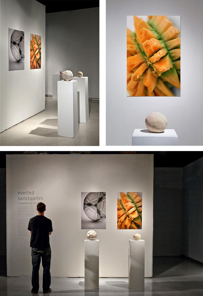
Everted Sanctuaries: Increments of Silence
Abstracted from Lewis’s Thesis Document:
Eversion is a biological term for the ability of an organism to turn itself inside out. For example, a sea cucumber can eject its internal organs to distract attacking predators. The sea cucumber sacrifices some vital functions for ultimate survival. Similarly, many introverts have become adept at temporarily everting their personalities to function in extroverted contexts. This masquerade often puts great stress on an individual. Cultural, educational, and professional environments do not often provide introverts the intervals of sanctuary necessary to revitalize themselves. Everted Sanctuaries communicates about the complex needs of introverts. The author explored introversion through sketching, object transformation, kinetic sculpture, material, and sound. In Everted Sanctuaries, transformed objects become metaphors to exhibit the often uncomfortable and stressful process of becoming uncharacteristically extroverted. These essays establish the importance of sanctuary for introverts and ask viewers to consider the depth and vulnerability concealed beneath their silent surfaces.
Ryan Lewis is an artist, graphic designer, and educator based in Kalamazoo, Michigan, USA. His time-based work exploring human personality has been shown nationally and internationally at venues such as Target Gallery in Alexandria, VA, Manifest Gallery in Cincinnati, OH, the South Bend Museum of Art in South Bend, IN, CICA Museum in Gimposi, Gyeonggi do, South Korea, and Video media, an International Video Art Festival at the Museum of Contemporary Art of Vojvodina, Novi Sad, Serbia. Ryan is an assistant professor of Graphic Design at the Gwen Frostic School of Art at Western Michigan University where he teaches courses in color, handmade books, advanced problem solving, typography and self-directed design research projects. In professional practice, Ryan has designed for the Voinovich School of Leadership and Public Affairs and Henry Schein, Inc, a Fortune 500 company. Ryan earned an MFA from the Ohio University School of Art+ Design in Athens, Ohio, and a BFA from Utah State University in Logan, Utah.
Heather Storer
https://www.behance.net/heatherjstorerdesign
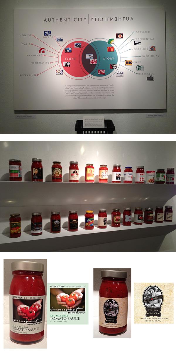
Authenticity in Branding
Abstracted from Storer’s Thesis Document:
It seems as though the practice of branding has become an art of deception. While there is no simple solution to a “quest for authenticity,” there is merit to further exploration and investigation of the idea of authenticity as it relates to branding. We live in an age where a product is not simply sold for product’s sake, but along with that product we are confronted with ideas about lifestyle, personality, history, experience, community, etc. Consumers are attracted to the story-telling aspect of brands; it helps us relate to a product and draws our attention and loyalties. However, consumers also expect some level of honesty from a company…some degree of truth. Finding the place at which “truth” and “story” can overlap will prove to be valuable to both consumers and designers. Consumers will have a heightened awareness of their participation in viewing and interpreting brand messaging as well as a greater attentiveness to brand story-telling devices such as nostalgia. Designers will have a greater consideration for the tactics used in creating brand messaging and how their aesthetic decision-making has such a strong effect on consumer beliefs.
Heather Storer is currently working as an environmental graphic designer as part of the experiential branding team at BHDP Architecture. Her clients include retailers such as Roche Brothers Supermarkets and Columbia Sportswear Company. She also has worked on corporate interiors and branding for clients such as Capital One. She completed my M.F.A degree in graphic design at Ohio University in May of 2013. As part of her graduate research, she completed a written thesis and exhibition on the topic of "Authenticity in Branding." Her professional interests span many aspects of branding including interior architecture, retail design, merchandising, packaging, environmental graphics, etc. After graduating from Miami University with her undergraduate degree in interior design, she gained professional experience working in retail and brand-oriented design in the Cincinnati area. She then decided to continue her education to strengthen her knowledge in design with a research focus in graphic design and branding. Storer’s retail and interior design experience, combined with her graphic design and branding work and research, have strengthened her skills and knowledge base for creating brand-driven experiences and environments. She is interested in any opportunities that will allow me to further develop my experiences in brand-driven design.
2012
Darren Baker
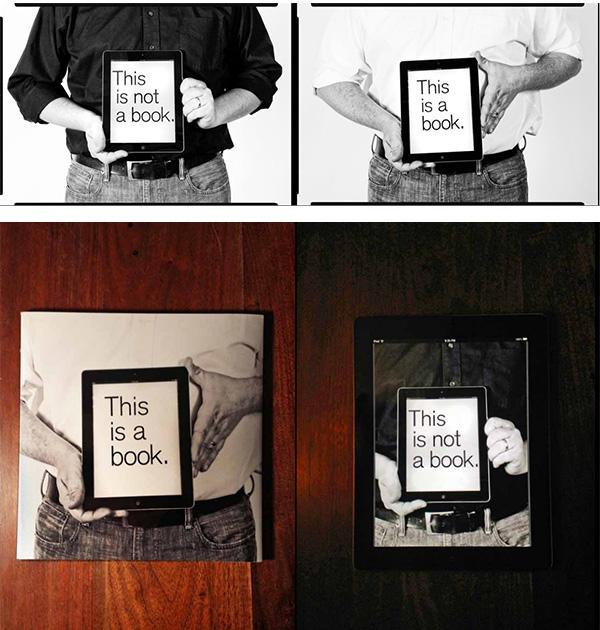
This is a book. This is not a book.
Abstracted from Darren’s Thesis Document:
In the broadest sense, the definition of a book can ranges from any drawn, written or printed text, reproduced by any means and circulated publicly. This expansive definition can include Phoenician bills of lading, letters from Emily Dickinson and the latest evolution in electronic book development, book-as-application. Scholarship tends to focus on the significance of a book through its conventional, objective relationship, contending that printed books have certain desirable qualities that have been honed over time, namely resolution, tactility, collectability, while electronic books have distinctions of their own (economy, searching, interlinking). Though not wholly incompatible, overlaying these characteristics creates a tension based in the notion that all books (printed, electronic, audio, etc) should adhere to a single, objective concept. Shifting the discussion from an objective book definition to subjective book definition by focusing on the largely ignored non-textual uses of the book, I was able to uncover the influences that these non-conventional practices have on the book’s iconic status and it how these continue contribute to the shifting terrain of the book in an electronic environment.
Darren Baker is a native to Southern Ohio. He attended Shawnee State University where he received a Bachelor’s of Fine Arts in 2001. His interest in designing and installing exhibits led him to a position with Hilferty and Associates, a highly regarded exhibit design firm based in Athens, Ohio, as a graphic and exhibition designer. When finalizing his main project, The Center for Disease Control Museum in Atlanta, at the end of 2003, Darren was asked to join the staff at the Southern Ohio Museum to assist in designing and fabricating Art of the Ancients, a collection of close to 10,000 Prehistoric Native American artifacts. This position eventually led Darren to become the museum’s Director of Visual Arts. In 2009, he was accepted into the newly formed MFA in Graphic Design at Ohio University and was in the first graduating class in 2012. He joined the faculty at Ohio University - Chillicothe in 2013.
His work includes graphic design, both analog and digital photography, letterpress, bookmaking. His work has been exhibited nationally and regionally. Currently, he is working on a series of work exploring the altered state of reality brought on by Alzheimer’s disease.
Dejan Mraović
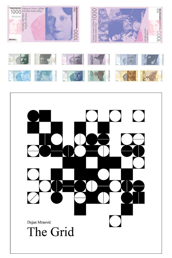
Graphic Ambassadors of a Country (Redesign of Serbian Banknotes and Coins)
Abstracted from Dejan’s Thesis Document:
Banknotes and coins act as ambassadors for every country… These graphic ambassadors help to establish the branding of the country. Therefore, before the process of design, the originators, or those in control of creating this voice, must consider what personifies the country, which personalities, and which motifs are appropriate for applying onto these valuable graphic ambassadors... It is necessary to show motifs that will cover as much as possible of the history, geography, culture, art, and politics. In that way, the banknote or the coin is able to show a long tradition of one country and its historical heritage…… Since the mission of the National Bank of Serbia is to maintain a stable currency, my goal, as an artist, was to (re)design banknotes and coins in order to (re)gain trust of Serbian citizens in the dinar. During the dictatorship of President Slobodan Milošević in the 1990’s, the dinar was an “anemic” currency: the countless notes issued look very weak, almost amateur. Can the people of Serbia be proud again of the appearance of their money? Could a new design symbolize a new Serbia, stable and prosperous? These questions were essential for my design thinking…… As a measure of protection for this currency, a completely new, sans-serif font entitled Serbiana was designed. Serbian is the only language in the world that uses both the Latin and Cyrillic alphabet: I included both alphabets for this font project . . . a redesign required attention to every detail. Serbiana, designed by a Serb, holds a unified visual voice regardless of having the message in a Latin or Cyrillic alphabet. Both share a unified aesthetic. My primary mission was to affirm a unified trust in the Serbian vehicle of monetary exchange, and to infuse it with pride. The final series of Serbian banknotes and coins was submitted to the National Bank of Serbia for consideration and possible implementation.
Dejan Mraović currently is teaching at Wayland Baptist University, Texas. Over the past six years, he taught design and was the design coordinator at both Cameron University and Campbellsville University. His design clients include: Wichita Falls Art Association, United Methodist Church, Red Dirt International Film Festival and Belgrade, Borba Newspaper to mention a few. He earned his MFA in graphic design from Ohio University in Athens, Ohio. He went to the College of Visual and Applied Arts in Belgrade, Serbia and Design School, in Belgrade. Besides graphic design, he is passionate about photography, film, and writing.
Sebastian Biot
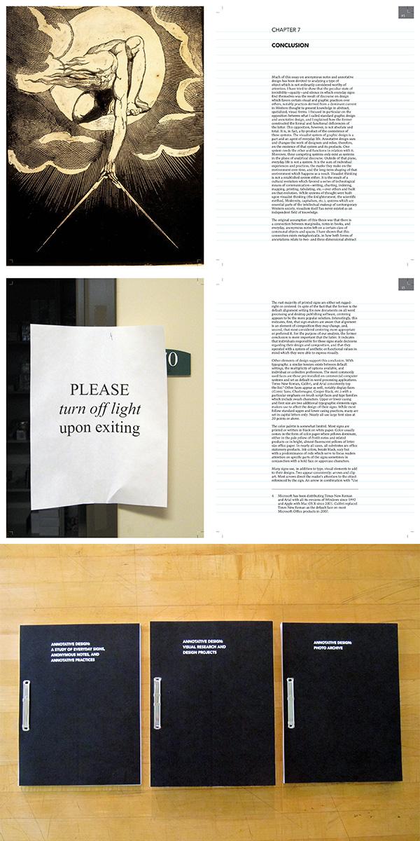
Annotative Design: A Study of Everyday Signs, Anonymous Notes, and Annotative Practices
Abstracted from Sebastian’s Thesis Document:
Looking at everyday anonymous signs found in break rooms, in hallways, on doors, etc., I argue that, collectively, they define a form of design I call “annotative design.” These practices, defined by their visual language, their materiality, their posting and placement strategies, point to a logic of design, reminiscent of book marginalia, that differs from standard professional graphic design practices. Using Michel de Certeau’s studies on the interplay of strategies and tactics in everyday life, I also argue that graphic design relates to visualist strategies connected to a tradition of spatialization of knowledge while annotative design uses tactical ways of operating.
Sebastian Biot is a freelance graphic designer and the creator of HyperEssays.net