Search within:

Accessible Documents

Document accessibility is a vast topic and can become quite complex. However, there are simple steps everyone can learn and do to help people with disabilities glean the information they need from your documents. These steps will also improve the general usability of your documents for everyone.

If documents are shared on the web or are required for students, faculty, or staff then those documents must be accessible. Please see the resources section for outsourcing services to help you remediate public and required documents.

Regardless of the type of document (HTML, Word, PowerPoint, etc.) you're working on, these principles are universal and will greatly improve the accessibility and general usability of your document.

  • Create a habit of using "Check Accessibility" whenever available
  • Use proper heading order
  • Make sure hyperlinks are descriptive
  • Add alternative text to all images that communicate important information (or mark them as "decorative")
  • Use simple tables only and make sure to set descriptive "headers"
  • Learn how to correctly convert a document to PDF

Accessible PDFs

The best way to create an accessible PDF is to start with an accessible source document (e.g., Microsoft Word). That way, if changes need to be made in the source document, the accessibility features can be preserved in the new PDF version.

If the original source document is not available, it is possible to remediate an inaccessible PDF using Adobe Acrobat Pro. Acrobat Pro has two features that can help automate this process. The first is the "Make Accessible Action Wizard" that will find and help walk you through fixing some common accessibility issues.

The second is a built-in "full accessibility checker" that will help verify the work done so far. While both of these will help improve accessibility, neither of these automated solutions can make your document fully accessible by themselves. A manual verification will always be required.

Please keep in mind that editing a PDF can have unexpected results, so consider saving your work often as new versions.

To dive deeper into PDF accessibility, please see WebAim's excellent online resource.

Creating Tags

Creating Tags

Accessible PDFs have tags added to the document. These tags provide the structure of the document. While users do not interact with the tags directly, assistive technology uses the tags for navigation. The PDF tags are similar, though not identical to, HTML tags.

When creating a document, the default view of a PDF within Acrobat does not show the tags. To show the tags tool, go to the view menu, then select show/hide, navigation panes, then select tags.

The most efficient and effective method of generating these tags actually starts with your source document. When creating a PDF out of a Microsoft Word (MS Word) document that is appropriately using styles such as headings and paragraphs, these styles will convert to the tags we need in the PDF document. If your document contains forms or tables, you will need to do additional work within Acrobat to make these accessible in the PDF.

The Action Wizard in the most recent version of Acrobat XI can guide you through some of the steps to make your PDF accessible.

Why use tags?

  1. Tags provide alternative text for images.
  2. Tags provide table markup such as headings.
  3. Tags provide heading and other structure of the document to aid in locating and navigating to content easily.
  4. Tags provide notice of language changes of text in document. Assistive technology will then speak the marked up text as appropriate for that language.
  5. Tags provide the order of the form fields when tabbing through a document (works with the Reading Order tool).

Outline of steps

  1. Optimize the source document for accessibility; for example, by providing sufficient color contrast between text and background and using semantic features like headings to identify sections instead of big, bold text.
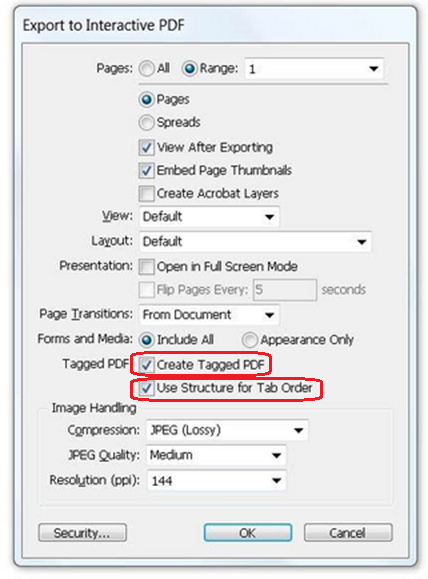
  2. Save the file as a tagged PDF.
  3. Provide metadata for the PDF, such as the document language.
  4. Create and edit tags (similar to HTML tags) to give structural meaning to the document and allow navigation with assistive technology.
  5. Ensure that the reading order - how the content is presented to screen reader users - is logical.
  6. Ensure that the tab order (when the PDF has form fields or links) is sequentially correct.
  7. Check the PDF with automated and manual testing to ensure accessibility.

Accessibility in PDF documents ideally starts with the source document, preferably a Microsoft Word document. For many tags, it is easier to put accessibility into the source document instead of trying to manually add them to the exported PDF. In particular, use the styles to designate headings and changes in text instead of manually changing font size and formatting. Avoid putting in empty line breaks as this will create unnecessary content in the PDF; if needed change the style to add spacing after paragraphs. When possible, use simple tables of one row and/or one column heading, as more complex tables will require more work with the tags in the exported PDF.

If you have a PDF generated from a scan of a hard copy, a lot of work will be required to convert this to text that is compatible with assistive technology. It is a better use of time to locate a digital copy of the original source and convert that than to attempt an Optical Character Recognition on a scan of a hard copy document. If you need to work with a scanned PDF, you will need to run the Optical Character Recognition tool and ensure the converted text is accurate.

Note on Google Docs: "printing" to a PDF from a google doc does not produce a tagged PDF document. To create a tagged document from a Google Doc, export to a Microsoft Word document format first, and then fix styles and alt text as appropriate. Then follow the steps to export to a tagged PDF.

How you convert the document matters. There are several different ways to generate pdfs from word documents. The one that best preserves the accessibility features is to use the Acrobat add-in installed into MS Word when you install Adobe Acrobat. When you export, you may need to select an option to produce an accessible tagged PDF. Other processes such as choosing "print to PDF" from the print menu option may not preserve the tags necessary for your PDF to be accessible, causing additional work to remediate the document.

Using Accessibility Checker

Using the accessibility checker

The accessibility checker available in Adobe Acrobat Pro will check for many common accessibility issues. It will generate a report of which elements pass and fail. The checker can tell you if a document title exists, but not if that title is descriptive. It can tell you if a document language has been set, it checks for the existence of tags for the content, and will remind you to check the reading order of the document. Once you have a tagged PDF, run the accessibility check as a reminder of the other issues you may need to fix in your PDF. 

Tables in PDFs

Tables

For documents that include tables, you should make sure the original tables are simple tables with one column heading and/or one row heading. After you convert your file to a PDF, you may need to edit or add the appropriate tags to identify cells as header cells. If you must use complex tables you may need to hire a document accessibility specialist to make sure your complex tables are accessible, so simplifying tables is a great advantage.

More Resources

Resources for making accessible PDF documents

Third-Party PDF Remediation Vendors

Learning to Remediate Documents

Microsoft Office 365 Accessibility

Office 365 and some prior versions have a built-in Accessibility Checker. This can be found in some versions under File > Info > Check for Issues or Review > Check Accessibility. This will identify a limited number of issues but is a great habit to build into your workflow. See Microsoft's Accessibility Checker help page for more information.

Accessible Microsoft Templates also offer a great way to get started with accessibility and speed up your workflow. They can also be modified to meet OHIO's design guidelines.

Universal Document Accessibility Principles

Universal Principles

Headings

One of the best ways to start creating more inclusive documents using Microsoft Word is to get into the habit of structuring your document using headings. It is tempting to just type your text and then change the size and boldness, but if you can get into the habit of using the Styles Pane to create your headings, you will make it a lot easier for people with disabilities to read your document.

Before you start writing, create an outline of your content by starting with Heading 1 (by the way, you can change the way all of your headings appear, or leave them as they are). Heading 1 will be the overall title of your document. You can either choose Heading 1 from the Style Pane or highlight your text and then choose Heading 1 from the style pane.

Heading 2 will be the supporting topic beneath heading 1 in outline form. Heading 3 will support heading 2 and so on.

Links

If your document contains links, use keywords in your content to create the hyperlink. In some cases, it is ok to hyperlink the URL, but keep in mind that a screen reader will read every character of that URL, so you'll need to have a compelling reason to do that. By hyperlinking the keyword or key phrase, people who use assistive technology will hear where the link will take them - and those who don't use assistive technology will see the emphasis on those key ideas. Avoid creating a hyperlink on words like "click here" because that is not descriptive enough. On the other hand, it is not necessary to hyperlink whole sentences or paragraphs.

If your hyperlink leads to a document like a PDF, be sure to include "PDF" in the hyperlink. Again, this lets all end users know what they're getting if they click on that link.

Images

If you're adding images to your document, make sure you right-click on the image and edit the "alt text" or alternative text. This is a short, succinct description of the image that will be read to people using screen readers. Do not add alt text that contains the words "image of" or "photo of" - the description should be short, but give someone who can't see the image an idea of what is being communicated using the image. This takes practice and creativity, but it is very important so that everyone understands important information. If your image is just decorative, there is a box you can check that says "Decorative Image" and screen reader users will not be made aware of the image.

Color

The difference between your text color and the background color must be at least 4.5:1 in most cases. If your document is black text on a white background, you don't have to worry about color contrast. But if there are any other colors in your document that contain important information, you must check the color contrast. The best way to do this is by using the accessibility checker in Word.

Color must not be the only way to convey information. If text is important and the only way you signify that it is important is to change the text color - a person who is colorblind may not be able to perceive that change. Make sure there is at least one other way to distinguish the important information.

Data Tables

If you are inserting a table in your document make sure you use the insert table option in the menu and give the table a descriptive header row. Complex tables (with multiple header rows and columns) are very difficult to make accessible, so whenever possible, only use simple data tables.

Converting to PDF

Once you create an accessible document, it is easier to convert that document into a PDF. For more information, please see WebAim's excellent article on converting Word to PDF and converting PowerPoint documents to PDF. It is important to remember that you should NOT choose "Print to PDF" and then upload that document to the web or distribute it widely. Print to PDF creates an image file that is not at all accessible for people using assistive technology.

Accessible PowerPoint Presentations

The built in accessibility check will highlight several of the items below and allow you to directly fix those items.

Use the built-in layouts, as these are connected to the outline. If you delete the text fields on the layout and add your own, the text you enter will not be accessible to screen reader users.

General accessibility of powerpoint documents follows the accessibility general principles. Images and other such content like charts and tables should have alternative text. Prior to distribution, you should remove animations and transitions. Embedded audio and video should have multimedia text equivalents. You should also ensure there is a logical reading order. The color contrast for text should be sufficient; you can use the feature to render in greyscale as a quick test.

Webaim's PowerPoint Accessibility provides additional step-by-step instructions on making MS Powerpoint presentations accessible.

Adobe InDesign Accessibility

Adobe InDesign is a design software application that can be used to create posters, brochures, flyers, newspapers, magazines, presentations, books, ebooks, and more.

The universal document accessibility principles should be followed when creating or editing InDesign files, just like with any other type of digital file. Additionally, be sure to use tags when exporting InDesign files to PDFs.

Using tags

Follow these guidelines when exporting InDesign files to PDFs.

  • Always export the file with tags.
  • Select Export, then select Save.
  • Make sure the two Tagged PDF checkboxes for Create Tagged PDF and Use Structure for Tab Order are checked.
Screenshot of InDesign Export to Interactive PDF options
Universal Document Accessibility Principles

Universal Principles

Headings

One of the best ways to start creating more inclusive files using InDesign is to get into the habit of structuring your document using headings. It is tempting to just type your text and then change the size and boldness, but if you can get into the habit of using the Styles Pane to create your headings, you will make it a lot easier for people with disabilities to read your document.

Links

If your file contains links, use keywords in your content to create the hyperlink. In some cases, it is ok to hyperlink the URL, but keep in mind that a screen reader will read every character of that URL, so you'll need to have a compelling reason to do that. By hyperlinking the keyword or key phrase, people who use assistive technology will hear where the link will take them - and those who don't use assistive technology will see the emphasis on those key ideas. Avoid creating a hyperlink on words like "click here" because that is not descriptive enough. On the other hand, it is not necessary to hyperlink whole sentences or paragraphs.

If your hyperlink leads to a document like a PDF, be sure to include "PDF" in the hyperlink. Again, this lets all end users know what they're getting if they click on that link.

Images

If you're adding images to your file, make sure you include "alt text" or alternative text. This is a short, succinct description of the image that will be read to people using screen readers. Do not add alt text that contains the words "image of" or "photo of" - the description should be short, but give someone who can't see the image an idea of what is being communicated using the image. This takes practice and creativity, but it is very important so that everyone understands important information. 

Color

The difference between your text color and the background color must be at least 4.5:1 in most cases. If your file is black text on a white background, you don't have to worry about color contrast. But if there are any other colors in your file that contain important information, you must check the color contrast.

Color must not be the only way to convey information. If text is important and the only way you signify that it is important is to change the text color - a person who is colorblind may not be able to perceive that change. Make sure there is at least one other way to distinguish the important information.