Please refer to these tips for creating inclusive content in any digital context. This is not a complete list of all accessibility success criteria, but following these tips is something everyone can do to improve digital accessibility.
Look for and use "Check Accessibility" whenever possible
In nearly all Microsoft products, search for the "Check Accessibility" feature and follow the instructions until the checker says, "No accessibility issues found." Make this a habit before uploading any documents for courses or larger audiences.
Learn more about using Check Accessibility on Microsoft products. Be sure to check product information for other digital products (like Canvas, Qualtrics, etc.) for similar accessibility checkers.
Understanding assistive technology
Assistive technology helps people navigate and access content. It can be a physical device, a piece of software, or even a built-in feature of an operating system. The Web Content Accessibility Guidelines (WCAG) are structured to maximize compatibility with assistive technology. Some examples include:
- Screen-readers help vision impaired individuals read screen content. They read content out loud and interpret structural information provided in documents and sites like headings.
- Refreshable braille devices help vision impaired individuals read screen content via moveable pins that create a line of braille text that can be read, then replaced with a new line of braille text. These devices often have custom input controls for navigation and text entry.
- Assistive software features come with many operating systems. Examples include screen magnifiers and high contrast modes.
To learn more about how people with disabilities use the web, visit the W3C website for Stories of Web Users.
Provide alternative text for images
One of the easiest ways to improve digital accessibility is to add meaningful Image Descriptions, or "Alt" text. This text is read by screen readers for non-sighted or visually impaired users. This description should generally describe the people, place, or action that is appearing in the image.

Short Example: Two students perform experiments within a lab.
Long Example: Two students, John Doe on the left, and Jane Doe on the right, perform bacterial colony counting during their Microbiology class.
Bad Example: Image_5
The amount of information placed within the Alt text should be contextual to the surrounding content. The shorter example is appropriate most of the time, using a few words that describe the function or content of the image. The longer example would be used if the people within the image, or their actions, are being directly written about within a news article, for instance.
Avoid using images to display text. Text embedded in an image, even if that text is also added to the Alt text, may be skipped or missed by the user if they decide to ignore images on the page or if they need to use high levels of zoom. There are techniques Web Services can perform on websites to display page text on top of an image if that effect is desired.
Structure and organize your headings
Page headings are used for outlining a page, not as a means of applying a style to your text. It is extremely important to use built-in tools to create headings on any webpage or document.
Your page outline is used by search engines and assistive technologies like screen readers to give the user, or the search engine, a better way of navigating through relevant text. If the user is looking for something located towards the bottom of a page, the page outline will allow them to skip to that section without having to listen to parts of the page that are not needed.
A typical page might look like this:
Heading 1 (Page/Main Title)
Heading 2 (first heading in the content area)
Content
New Heading 2
Content
Heading 3 (sub content of heading 2)
Content
New Heading 2
content
Etc.
Think about headings the same way you would think about organizing a long document using an outline. Heading one is the largest heading, heading two is smaller and less important, heading three is smaller and a subcategory of the last heading two and so on.
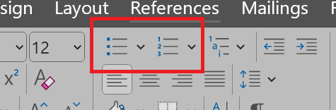
Use built in tools to create bullet and numbered lists
Use tools built into editors to create lists with numbered or unordered lists instead of using the tab key and symbols. Using built in tools provides code you cannot see that lets people who use screen readers understand the list you create.
For most products, the editor will look like this:
Create unique and descriptive links
Accessible hyperlinks help all users, especially those with disabilities using assistive technologies like screen readers, understand the purpose and destination of a link.
- Use descriptive text for the link - for example, instead of writing "click here for the application form" where "click here" has the link embedded, write: "download the application form..." where the keywords that describe the purpose of the link, so it makes sense out of context.
- Make sure users can understand the purpose of the hyperlink out of context. Screen reader users have the ability to generate a list of all the links on a web page in order to scan content. Instead of just hyperlinking one key word like "book", be sure to provide context like "history book".
- If you are hyperlinking to documents, media, or other types of downloads, be sure to let people know in the hyperlink. For example, "download the History 101 (PDF)" or "watch this History of the ADA (video)".
Enable and edit captions on every video
For a video to be accessible, captions must be present when using video in your course.
For Panopto users, learn to use and then edit automated speech recognition (ASR).
Keep in mind that if you add a video to a PowerPoint presentation (or in any other presentation software), the video must have captions and you must enable those captions when you play the video.
Accurate video captions are required on all videos to meet accessibility standards. Do not rely on auto-generated captions. While automatic captioning technology is improving, you must check and edit those captions for accuracy. If you are not the owner of the video, contact the owner and request they activate and edit the captions.
Learn more about how to edit video captions on the OIT Accessibility website.
Do not use color as the only way to convey information
Color can be used to help people better understand context, where they are on a website, when they have made a mistake and so much more. But for people who are color-blind (about 10% of males and 2% of females) if color is the only way something is communicated, they may miss it or misinterpret it. Be sure to use more than just color to convey information. You can also use text, symbols, or shapes as well.
See Understanding Success Criteria 1.4.1 for more information.
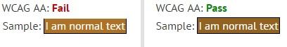
Provide enough color contrast
When selecting colors to display on your webpage, it is very important to make sure the contrast between the text and the background is within a recommended ratio of 4.5:1. If the ratio is too small, users with certain visual impairments may not be able to comfortably read your page's content, or they will not be able to read the page at all. If you are unsure, a good tool to use is the WebAIM Color Contrast Checker.
Here is an example of just how close good and bad contrast can be:
Simplify data tables and apply appropriate headers
Placing a table on your site should only be done for displaying tabular data. Tables must not be used for any other reason such as page layout. You should also try to avoid complex tables with nested tables or with header cells that span multiple rows or columns, as screen reader users can encounter problems accessing these tables.
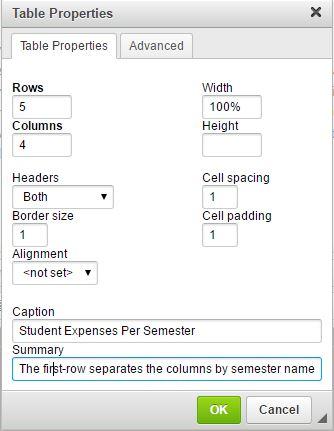
When using a table, there are a few additions each table should have to be considered an accessible table. When adding a table using the Rich Text Editor, along with setting the desired column and row numbers, it will also ask if the first row, column, or both should be treated as a header. This is very important for a screen reader in order to know how to read the table to the user. Without headers, the screen reader will read the full contents of the table, from the upper left cell to the lower right cell without giving any context as to what is being displayed.
Other fields provided while creating a table are the Caption and Summary fields. The Caption should title the table and will appear above the table when it is displayed. Something along the lines of, "Student Expenses Per Semester," is an example of a Caption.
The Summary, contrary to what it sounds like, does not describe the table. Instead, it is used to tell the user how to properly read the physical table. The Summary is only available to screen readers; sighted users will never see the Summary. A Summary, for our tuition table example, would be, "The first row separates the columns by semester name. The first column displays the different expenses a student may encounter."
| Expense | Fall | Winter | Summer |
|---|---|---|---|
| Tuition | $5,872 | $5,872 | $2,500 |
| Room | $3,296 | $3,296 | $800 |
| Board | $2,838 | $2,838 | $1,432 |
| Book and Supplies | $515 | $515 | $112 |
Get PDFs remediated before uploading to a website or sending to large audiences
If you must use a PDF on any official Ohio University owned websites, you will need to contact University Communications and Marketing to have that PDF professionally remediated per the Web CMS User Policy.
Quick Tips to Improve Digital Learning Experiences
- Contact Accessibility Services if any of your students are reporting accessibility issues.
- During a synchronous online course session, ask all participants to mute microphones unless they are speaking.
- If you are using Teams to deliver a lecture in real time, change your status to “Do Not Disturb” and close mail and other programs that send you notifications.
- Turn captions on for videos when using them in presentations.
- Turn on “Live Captions” if it is available (PowerPoint instructions):
- Live captions work best on the desktop version of PowerPoint – you can share your desktop during the presentation.
- Rehearse your presentation to see how it works with captions turned on.
- Use an external microphone if possible (earbuds with a microphone, AirPods will work as well).
- Speak clearly.
Learn more about creating a more accessible learning experience from Lynda.com (free with a Library card account).
Make sure there is an accessibility statement on your syllabi
Sample Syllabus Statement:
"Any student who feels they may need an accommodation based on the impact of a disability should contact me privately to discuss your specific needs and provide written documentation from Accessibility Services. If you are not yet registered as a student with a disability, please contact Accessibility Services at 740-593-2620 or visit the office in Alden Library, Suite 230."
More resources for accessible content
- Make your content accessible in the Microsoft 365 Apps
- Microsoft Accessibility Video Training
- Microsoft Accessibility Fundamentals Learning Path
- Canvas Accessibility Playlist (YouTube)
- Quick Reference for WCAG 2.1 AA Guidelines
- Simplified WCAG Checklist from WebAIM
- WebAIM Document Accessibility Course (beginner level)
- WebAIM Word and PowerPoint Accessibility Evaluation Guide (how to fix the issues in Accessibility Checker)
- Get Documents Remediated via UCM