The Central Principles of Design
Designing isn’t as simple as putting some graphics and text on a piece of paper. This profession takes training, research and a few bad designs to really get it right. Below you will find some common best practices that we see daily to consider in creating captivating graphics for your audience.
Top 10 design rules you should consider when creating marketing collateral

01. Design for your audience
Each program or event will have a target audience attached to the event. The most important piece of information to keep at the forefront is “Who are you designing for?” This audience will be receiving and acting on the communication that’s being sent to them and will inform the layout, design and content of the piece.
The left image above uses a serif font with many frills that give the impression that this is a formal event. Since this is an event that is workout based and geared toward a student audience, a sans serif, bold font is a better choice as indicated on the right.
02. Create meaningful hierarchy
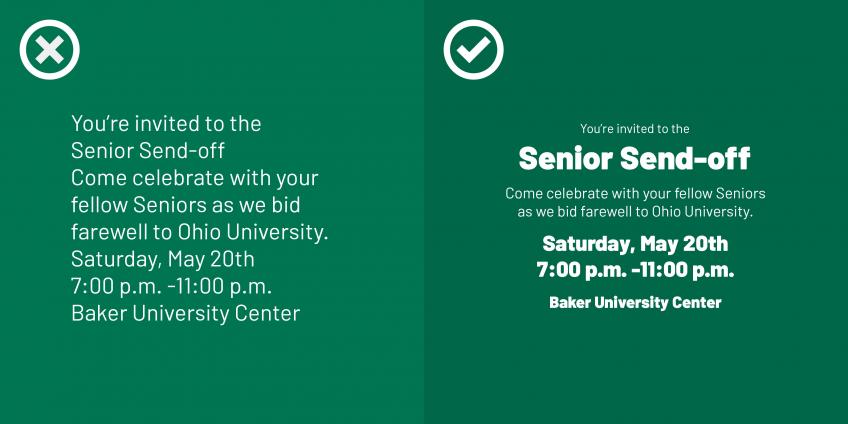
Hierarchy speaks to the order of information in a design to show importance. Be sure that the most important information on the poster has the most emphasis. Ways to achieve this include, size and weight of fonts, color or scale. Using these techniques will let your audience know what information they should be paying close attention to.
In the example, the left image shows the text in one weight and aligned to the left with no visual cues as to what the most important information is. On the right, it’s clear that the event is the “Senior Send-off” and date and location is specified in a bold text.
03. Keep alignment and margins top of mind
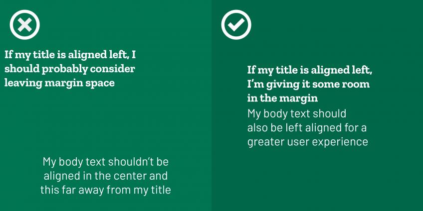
Alignment is the idea of lining up visual elements such as images and text to create uniformity in a design. This allows the eyes to move through the content with ease and provide readability to the audience. Alignment also works in relation to the margins of a page. An effective design keeps important information inside of the margins. A good rule of thumb is keeping text and other important content an inch and a half from the margin on an 8.5” x 11” document.
The left side of the image above shows a title that is not in proximity to the body text. In addition to this, the title is too close to the edge and not aligned with the body copy. On the right, the example shows the title and body in close proximity to one another and both aligned to the left for easy readability.
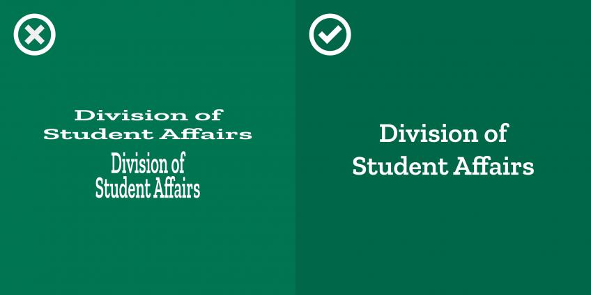
04. Use a simple font palette
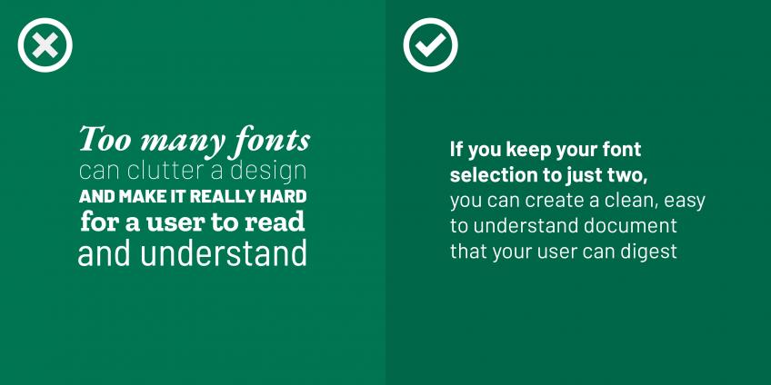
Ohio University’s font library contains three fonts that represent the brand and feeling they want to portray to the audience. The official OHIO fonts are P22 Mackinac and Termina. The secondary font that’s available is Proxima Nova. It’s best practice to only use 2 differing fonts on a piece to maximize readability. To learn more about OHIO’s fonts visit the brand typography guide.
The left example shows that many different fonts and weights can take away from the experience of the user and could ultimately confuse them. On the right, only two fonts were used and the content is easy to read and understand.
05. Use colors that are cohesive and complement each other
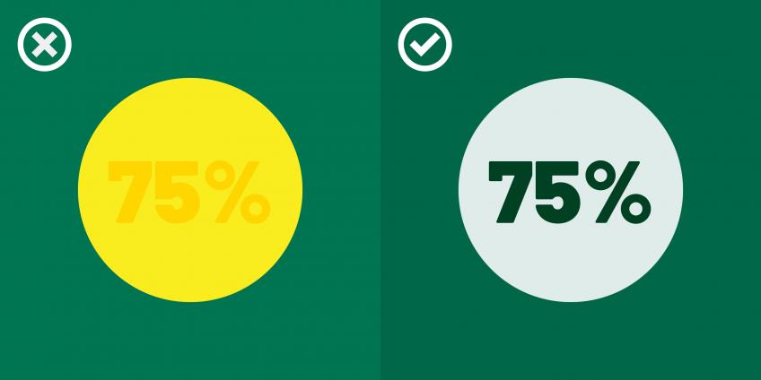
Color is a simple way to make your design stand out. Using colors to complement each other, rather than distract your reader, makes for a cohesive design. Ohio University’s color palette includes the official University colors, which are Cutler Green and Cupola White. It also designates a variety of colors in their accent color palette. To learn more about the Ohio University Color palette and to view the colors, visit their brand color guide.
The colors in the example above on the left are too close in yellow color to easily distinguish what the text reads. On the right, a lighter color was used and the text is dark enough to provide optimal contrast for readability.
To use the University colors in Microsoft programs use the following instructions:
Word for Windows
- Click on “More Colors” at the bottom of the dialog box.
- At the top of the next dialog box, click on the Custom tab.
- Enter the appropriate RGB values from the color chart.
- Click “OK.”
Word for Windows does not support CMYK, so do not use it to prepare documents that will be printed using a four-color process, such as commercial printing.
Word for Mac 2011
- Click on “More Colors” at the bottom of the dialog box.
- At the top of the next dialog box, click on the sliders icon.
- From the drop-down menu, choose “RGB Sliders” (for documents or presentations that will be shown only electronically) or “CMYK Sliders” (for documents that will be printed using a four-color process, such as commercial printing).
- Type in the appropriate values from the above chart for the color you want to reproduce.
- Click “OK.”
06. Insert images only at the appropriate resolution
Have you ever found an image on the internet and when you printed it, it came out looking grainy? This is because the resolution of an image, especially in print, matters. When designing for print design, we need an appropriate dpi (300), which is dots per inch. The more “dots” that an image contains the better the resolution or clarity of the image. A general rule of thumb is if the image is lower than 1MB (megabyte) it’s probably low resolution and cannot be used in a print piece.
The image on the left was pulled from a website and isn’t properly formatted for print and looks pixilated. On the right, the image was downloaded from the source and is at 300dpi and ready to use for print.
Ohio University provides a photo archive to gather high-resolution images for use. When downloading these images, always select “original size” for the best resolution in your pieces possible. If you do not have access to Photoshelter, please request access through UCM.

07. Keep it clean and readable
White space is your friend. Many beginners feel that white space needs to be filled with more text or more images, but this is simply not the case. Only provide images and text in your design that will be effective for the audience to understand what program or event you are hosting, nothing more and nothing less. If you think that something additional needs to be in the design, ask yourself the purpose of the additional elements before adding them.
In the example on the left the imagery is overpowering and the title is too close to the picture. In addition, too many fonts are used and it’s hard to understand the hierarchy. On the right, we’ve ensured that there’s enough white-space to not confuse the user and the flow is easy to understand.
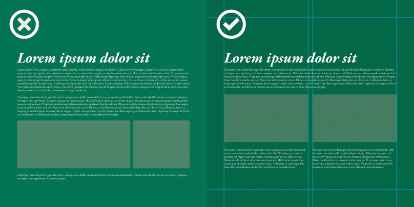
08. Use a grid
Adding a grid to your initial design can provide a framework and alignment of where your content should go. The more columns your grid will have, the more flexibility your design will have. Set up a grid by placing guides within your margins. Search “align objects on a grid” in the Microsoft Help window of Microsoft Word to configure these grids.
The example on the left shows a design that doesn’t use a grid. The right example utilized a two-column grid and how information can be arranged to support the grid.
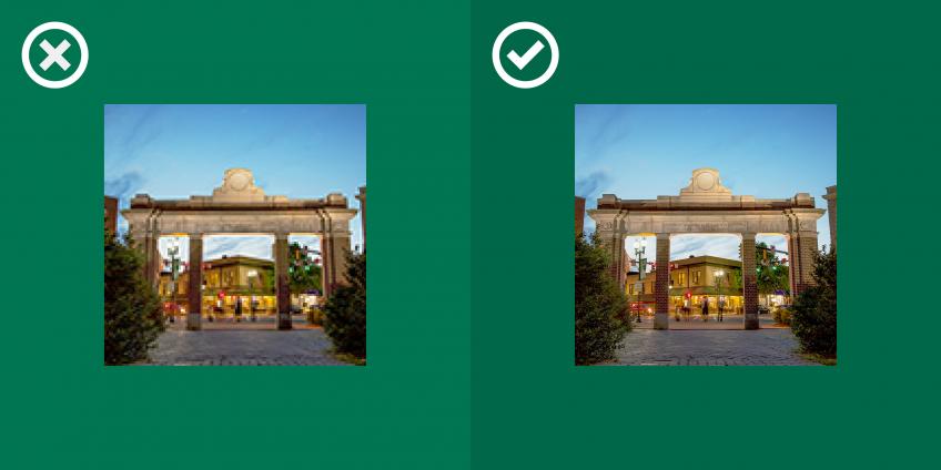
09. Never stretch your type or images
Fonts are created to remain true to their original state. If a type doesn’t fit your design, try another weight. In addition, stretching images will distort the way the audience perceives what is being presented. Please also keep in mind that a photographer, captured the image and created a visual representation of that composition and it is wrong to distort it.
Above, the left side of the image shows text that’s been distorted. On the right, the text has been enlarged to keep the constraints of the text true to the font size.
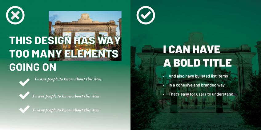
10. Don’t use too many elements or effects
Too many elements can hurt a design and affect the audience’s ability to effectively read the intended message. Be clear and concise about your placement of additional imagery, text or textures.
In the example above, the left side features an image, title with an outline around the text, icons and two non-complementing fonts and it’s extremely hard to find the flow of the design. On the right, the image is used as a background and the text is overlaid in a simple format to improve readability.